Printing on Kraft Boxes: Black Ink, White Ink and Colour
By the team at The Kraft Boxes ·
Ink on brown kraft never looks quite like it does on a white screen, and knowing why saves you from a disappointing first batch. This guide covers black, white and colour printing on kraft, with the fixes printers use when colour has to stay bright.
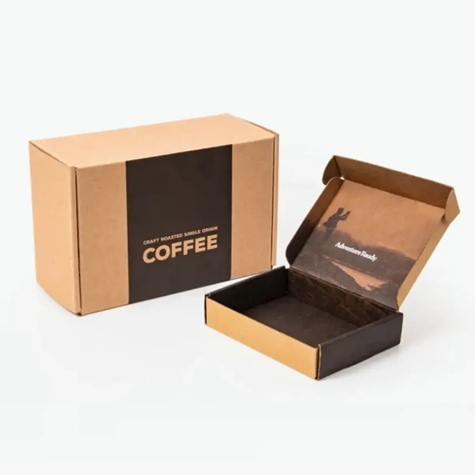
Why does ink look different on brown kraft?
Most printing inks are partly see-through. On white board, light passes through the ink, bounces off the white surface and comes back bright. On brown kraft, the board itself tints that light before it reaches your eye.
So every colour you print picks up some of the brown underneath. Dark colours barely change. Light and bright colours change a lot, and pale tints can almost disappear.
Kraft also soaks up ink more than coated white board. The ink spreads a touch into the fibres, which softens edges and makes solid areas look slightly mottled. Many people like that hand-printed look, but it helps to expect it.
How do common colours shift on brown board?
The table compares what a colour looks like on white board with what it usually becomes on plain brown kraft. These are typical results, not exact matches, because board shade and ink density vary.
| Ink colour | On white board | On brown kraft | Usual fix |
|---|---|---|---|
| Black | Deep black | Still strong, slightly warm | None needed |
| Navy or dark green | Rich and clear | Darker, close to black in small text | Lift the shade a step |
| Red | Bright red | Brick or rust red | White underprint |
| Yellow | Bright yellow | Mustard or olive, often weak | White underprint or avoid |
| Light blue | Sky blue | Greyish teal | White underprint |
| Pastel pink | Soft pink | Barely visible | White underprint or white-lined board |
| White | Not used | Creamy white, slight brown show-through | Two passes of white |
If you already know your colours are pale, our guide to kraft board grades explains white-lined board, which avoids most of these shifts.
Why is black ink the safest choice on kraft?
Black sits darker than the board in every light, so it keeps its contrast whether the box is on a bright shelf or a dim doorstep. A one-colour black logo is the classic kraft look for that reason.
Black also forgives the slight spread of ink into kraft fibres. Text stays readable at smaller sizes than any light colour would allow.
Corrugated board adds one more quirk. The flute under the liner can show through large printed areas as faint stripes. Black logos look sharpest on open brown space, not inside a big solid panel.
As a rough guide, keep black text at 6 pt or larger on folding kraft and 8 pt or larger on corrugated. Keep lines at about 0.25 mm or thicker so they do not break up on the rough surface.
When does white ink work on kraft?
White ink on brown board gives a soft, crafted look that suits candles, soap and gift boxes. It is one of the most requested finishes on kraft.
White is still slightly see-through, so a single pass looks creamy with a little brown showing through. Printers often lay white down twice to make it more solid. Expect a warm white rather than a paper white.
Fine white text is harder to print than fine black text. Keep white lettering at about 8 pt or larger and avoid hairline details, which can fill in or break up.
White lettering on brown is a favourite for kraft candle boxes for jar candles. A short scent name in white sits well on the front panel.
What is a white underprint, and when do you need one?
A white underprint is a layer of white ink printed first, exactly under the parts of your design that need to be bright. The colour then goes on top of that white instead of on bare brown board.
It brings reds, yellows and light blues much closer to how they look on screen, while the rest of the box stays natural brown. The result is bright artwork framed by kraft.
The white layer must line up with the colour on top. Printers usually shrink the white by about 0.1 to 0.2 mm on every edge so no white halo peeks out if the sheet shifts slightly.
If most of your box is covered in colour, white-lined kraft is often simpler than a large white underprint. It gives a white face to print on, with brown on the back.
Full colour on kraft: what should you expect?
Full colour printing builds images from four process inks. On brown kraft without a white base, photos look darker, warmer and lower in contrast, rather like an old print.
That can be a deliberate style for a rustic or vintage brand. For product photos or skin tones that must look true, ask for a white underprint under the image or choose white-lined board.
Spot colours behave a little better than process colours here. A single mixed ink lays down as one solid film, so it covers the brown more evenly than four thin layers built up dot by dot.
Full colour on the inside of a mailer is another option. With a white-lined inside, an inside print can be bright while the outside stays plain brown with a one-colour logo.
Which designs suit brown kraft best?
- One-colour logos in black or a deep spot colour, placed with plenty of brown space around them.
- White line drawings, botanical sketches and simple patterns that let the board show through.
- Bold, chunky type rather than thin script fonts with hairline strokes.
- Two-colour designs that pair black with one bright colour on a white underprint.
- Inside prints with a short message, pattern or thank-you line on the lid.
These ideas work across most of the range. Mailers carry them particularly well, as you can see on our printed kraft mailer boxes with logos.
How do you plan kraft artwork in seven steps?
- Pick the print plan first: no ink, a single ink, two inks or full colour, and whether it goes outside, inside or both.
- Set your logo in black or white and check it still reads at the size it will print.
- Mark any bright colours that need a white underprint, or choose white-lined board instead.
- Convert colours to process values, or name the spot ink you want matched.
- Thicken fine lines to at least 0.25 mm and enlarge small text to the sizes above.
- Send your logo in vector format, such as PDF, SVG or EPS, with fonts converted to outlines.
- Check the free proof closely, especially colour notes and the position of each panel.
For panel layout, bleed and safe zones in millimetres, read our kraft box artwork and dielines guide before you finalise files.
Can you print inside a kraft box?
Yes. Inside print is an option on most styles, either inside only or outside and inside together. It turns the moment the lid opens into part of the design.
Inside print on plain brown behaves the same way as outside print, so black and white are the safest choices. On a white-lined inside, colour can be much brighter.
Remember that inside print on a lid reads upside down until the lid opens. Your designer checks the direction of every panel on the proof.
A short line of text often works better inside than a busy pattern. People read the inside of a lid up close, so a thank-you note or a care tip in plain black reads well.
Lidded gift boxes suit this well. The inside of our kraft gift boxes with fitted lids stays hidden until someone lifts the top.
How do you avoid colour surprises on your order?
Screens glow and boxes reflect light, so no box will match a monitor exactly. Brown kraft widens that gap more than white board does.
Tell us which colours matter most, such as a brand red, and we note them on the proof. Proof changes cost nothing and have no limit, so adjust colours until you are happy.
On a written quote, printed kraft is priced from £0.25 per unit, and the figure moves with box size, ink count and order size. Printing runs for 4–6 business days after sign-off. Boxes then travel flat on free tracked UK delivery, landing 2–3 business days later. You can try your logo on a kraft box before you send a brief.
Boxes Mentioned in This Guide
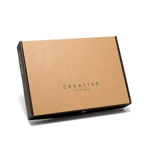
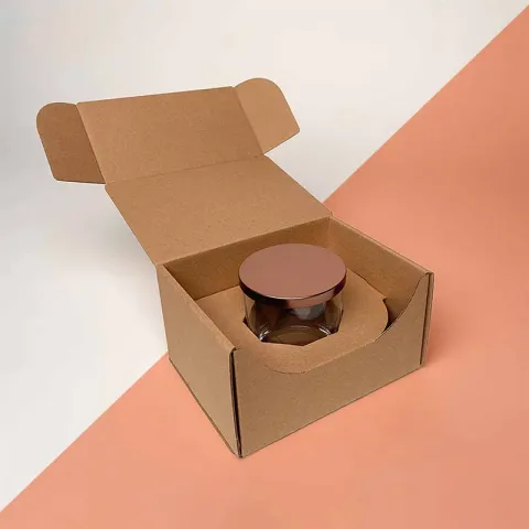
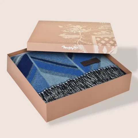
12questions answered
Questions About This Guide
Straight answers from the people who cut and print the boxes. Open any question to read the reply.
Why does my red logo look brown on a kraft box?
Most inks are partly see-through, so the brown board tints them. A white underprint under the red, or white-lined board, brings it much closer to the original.
Is white ink on kraft pure white?
Not quite. White ink is slightly see-through, so on brown board it reads as a warm, creamy white, and printers often lay it down twice for more cover.
What is the smallest text size that prints well on kraft?
As a guide, about 6 pt for black on folding kraft and 8 pt on corrugated. White or light text needs to be larger, at about 8 pt or more.
Do I need a white underprint for every colour?
No. Black and dark colours print well straight onto brown kraft. A white underprint mainly helps reds, yellows, light blues and pastels.
Will photos print clearly on brown kraft?
Photos printed straight onto brown look darker and warmer, like an old print. For true colour, ask for a white base under the image or white-lined board.
Can I print one colour outside and full colour inside?
Yes. That mix is an option on most styles, and a white-lined inside makes the inside colour much brighter.
Can you match my brand colour on kraft?
We can match a named spot ink, but brown board changes how any colour looks. We note your key colours on the proof so you can judge them before printing.
Does ink rub off kraft boxes?
Ink soaks a little into kraft fibres, which helps it hold on the surface. Large dark solids can still mark with heavy rubbing, so line art usually wears better than big solid areas.
Which file format should I send for kraft printing?
A vector file such as PDF, SVG or EPS with fonts converted to outlines works best. A high-resolution PNG is fine for a first look while we prepare the proof.
Is two-colour print better than full colour on kraft?
Often, yes. Two strong inks, such as black and a bright colour on a white underprint, usually look cleaner on brown board than a full colour photo.
Why does a solid block of colour look patchy on kraft?
Kraft absorbs ink unevenly because of its natural fibres, so large solids can look slightly mottled. Many brands like the effect, but outlines and line art avoid it.
Can I see how my logo looks before ordering?
Yes. You get a free design proof showing your artwork on the dieline, with unlimited edits, before anything goes to print.
Tell us what you ship
Send the product, a rough size and a quantity. We reply in writing within one business day with a price and a free design proof. Prefer to talk? Call +44 7578 382054 or message us on WhatsApp.